RSS

Paste the following link into your feed reader:

https://www.powersite123.com/blog/rss
Why Your Website Technology Is Hindering Your Online Fundraising and Awareness

What You Should Know

Website building1. How do most nonprofits build their websites?
a. Most nonprofits build and maintain their websites using a Content Management System (CMS). There are at least 200 Content Management Systems used by nonprofits. Three of the most popular are WordPress, Drupal, and Joomla.
b. All CMSs work essentially as the name implies. They enable you to manage the content of your website -- typically that includes text, images, and links, if you are lucky, maybe a bit more. If the main thing you want your site to do is display information, then a CMS may work just fine for you.


Website growth2. How should you build your website so you can get the best results from it?
a. If you would like your site to draw more traffic, raise more money, be more interactive, and do many other types of transactions, no CMS will enable you to do all of that. Fortunately a new generation of technology can. It’s called a Functionality Management System.


3. What are the advantages of an FMS over a CMS?
a. As easily as a CMS enables you to manage your site’s content, a good FMS will enable you to also manage your site’s functionality, design, navigation, SEO, reporting, security, administration, and every other aspect of your site.
b. If your site was built using a CMS such as the ones mentioned above, and you don’t know those tools, you will be unable to maintain your website. Even if you do know, say WordPress, you probably only know it up to a certain point. If you want to make changes to your website that are beyond your knowledge, you either need to hire outside help, or more likely, they simply will not get done. A good FMS enables, you, or anyone without technical skills or even training to easily maintain every aspect of your website – often through simple point-and-click.

Website globe4. Where can you get information about available FMSs?
a. Here are some places where you can get information on website tools for nonprofits:
    i. Tech Soup, based near San Francisco, is a valuable repository of information pertaining to nonprofits’ use of the Internet. This includes information about various website tools, platforms, and vendors.
    ii. Nonprofit Matrix:  NonProfit Matrix as the name implies, is a matrix of tools and vendors to meet nonprofits’ IT needs.


What Should You NOT Do?

1. Don’t use a CMS to build or maintain your website – or worse, program it in a raw code such as HTML.

What You SHOULD Do

1. Use an FMS to build and maintain your site.
2. Actively use the various features of your FMS to manage all aspects of your site, including functionality, design, navigation, SEO, reporting, security, administration, etc.
3. Suggest enhancements to your FMS vendor, and learn/use the new enhancements as they are released.
4. Use your FMS to build a site that not only has a lot for the visitor to SEE, but also a lot for them to DO – so you can build awareness, engagement, and revenue.

Click here for a FREE Private Internet Consultation with a world-renowned nonprofit website expert.
You’ll get valuable feedback and advice regarding your website and its traffic, search engine optimization, social media, and online marketing.

Posted in Nonprofits, Online fundraising | 20442 Comment(s) | Add Comment
Mobile optimzation
How You Might Be Alienating Half of Your Website Visitors – and Losing Their Donations!

What You Should Know

mobile optimization1. What % of your website visitors are using mobile devices?
a. When was the last time you used your mobile phone to access a website? It probably was within the last 24 hours. Well, it stands to reason that if you used your phone to access someone else’s website recently that other people are using their phones to access yours.
b. Studies show that more than 25% of website searches and website access is now done via mobile devices.
c. That percentage is growing rapidly.
d. Some nonprofits get more than half of their website traffic from mobile devices.
e. Some of your online visitors ONLY access the web from a mobile device.   They don’t even own a desktop computer.

2. Why should you mobile optimize your site?
a. Greater usability. If a visitor is accessing your website using their iPhone, and your website is not mobile optimized, they may have difficulty navigating, donating, and doing the other things that you want them to do.  In other words, having a mobile optimized site can help you to maximize your conversion rate -- that is, the percentage of your website visitors who become converted into donors, event attendees, volunteers or others who do things that you want them to do.
b. Better search engine optimization.  Google has announced that if your site is not mobile optimized it can significantly hurt your search engine standing.
c. Catering to mobile vs. desktop needs.  Mobile users typically have different needs than desktop users. For example, mobile users may be more likely to need your contact information, directions, or to be able to quickly do transactions such as donating or buying event tickets.  Therefore, your mobile site should focus on these focused pieces of information and transactions than replicate your entire desktop site.
Boost mobile trafficd. Boosting traffic.  Studies show that more than 25% of website searches and website access is now done via mobile devices. That number, of course is growing. Your organization should want to get your share of that growing mobile traffic. One way to do that is to have a website that is easily accessible and navigable by mobile users. Also, related to this, you should be tracking your website traffic -- including the percentage of your website traffic that comes via mobile users, and you should be tracking the change in that percentage over time.
e. Reducing bounce rate.  Just because you can pull up your website on your phone doesn’t make it mobile optimized.  Any website will display on any mobile device!  However, if a mobile user of your site must pinch, zoom, scroll, or squint excessively, that may not be the most pleasant experience for them – and they may leave.
f. Better brand perception. Even if you are a small local nonprofit, branding should still be important to you. People will develop their perception of your brand not only based on your off-line marketing and your desktop website but also your mobile site. In fact over 90% of people say that they access the same websites on multiple devices.  Therefore you should make sure that the experience of your mobile website users is just as rewarding as their desktop experience.
g. Avoid Flash.  Since Flash will not work on an iPhone, iPad, or any Apple device, you should avoid any use of Flash in the mobile version of your site.

Responsive design
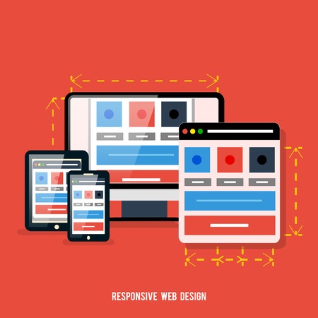
3. What is “responsive design” and should I use it?
a. “Responsive design” is sometimes used synonymously with “mobile optimization”.  However, there is a distinction.  A responsive site, sometimes called liquid, will automatically morph as the size of the user’s window changes.  This can even happen on a desktop – as a desktop user decreases or increases the size of their browser window, a responsive site will automatically change to fit the size of the window.  Of course, if a user access your site on a tablet, phone, or other mobile device – which has a smaller screen, the website presented to them will automatically adjust to that smaller screen.  As cool as this sounds, one issue with this approach is that it can be very difficult for a graphic designer to create a design that looks good and confirms to best practices even as it is constantly changing.


Example:

Let’s say that you have a header at the top of your home page (or every page) which is 1,000 pixels wide.  Now let’s say that one of your users reduces the size of their browser window to less than 1,000 pixels wide – or looks at your site on an iPhone with a much narrower screen.  What happens then?  Do you display only a fraction of the image?  Do you split the image and display one part below the other?  Do you omit the image altogether?  Obviously none of these are good options, but responsive design may force you to choose one of these not-so-good options.


b. On the other hand, a non-responsive but still mobile optimized design should automatically detect the device used by each of your website visitors, and then automatically redirect them to a version of your site optimized for that device – say an iPhone or iPad version.  This way your designer can develop a design for each type of device that is optimal for that device and fits its screen size.

4. How should I mobile optimize my site?
a. Some mobile optimization is done manually.  This could result in the mobile optimization being more expensive, time-consuming, and risky. With manual coding, even one bug in the programming could result in the mobile optimization not working properly. The better way to do it is to mobile optimize your site in an automated fashion. This will entail less time, cost, and risk, in part because it will should properly the first time without any testing. Also by having your site automatically mobile optimized, you’ll be able to make any changes you want to your website without having to go back and read mobile optimize your site. If you make a change to your desktop website it should be instantly reflected in the mobile version of your site.


What Should You NOT Do?
1. Don’t mobile optimize your site manually.
2. Don’t avoid mobile optimizing your site altogether.
3. Don’t assume that few of your website visitors are using mobile devices.

What You SHOULD Do
1. Use an automated approach to mobile optimize your website.

Click here for a FREE Mobile Optimization Consultation with a mobile optimization website expert.
You’ll get valuable feedback and advice regarding your desktop site and how to improve it while mobile optimizing it.


Posted in Mobile websites | 14159 Comment(s) | Add Comment